Somerset Project 3
- Space: Kitchen
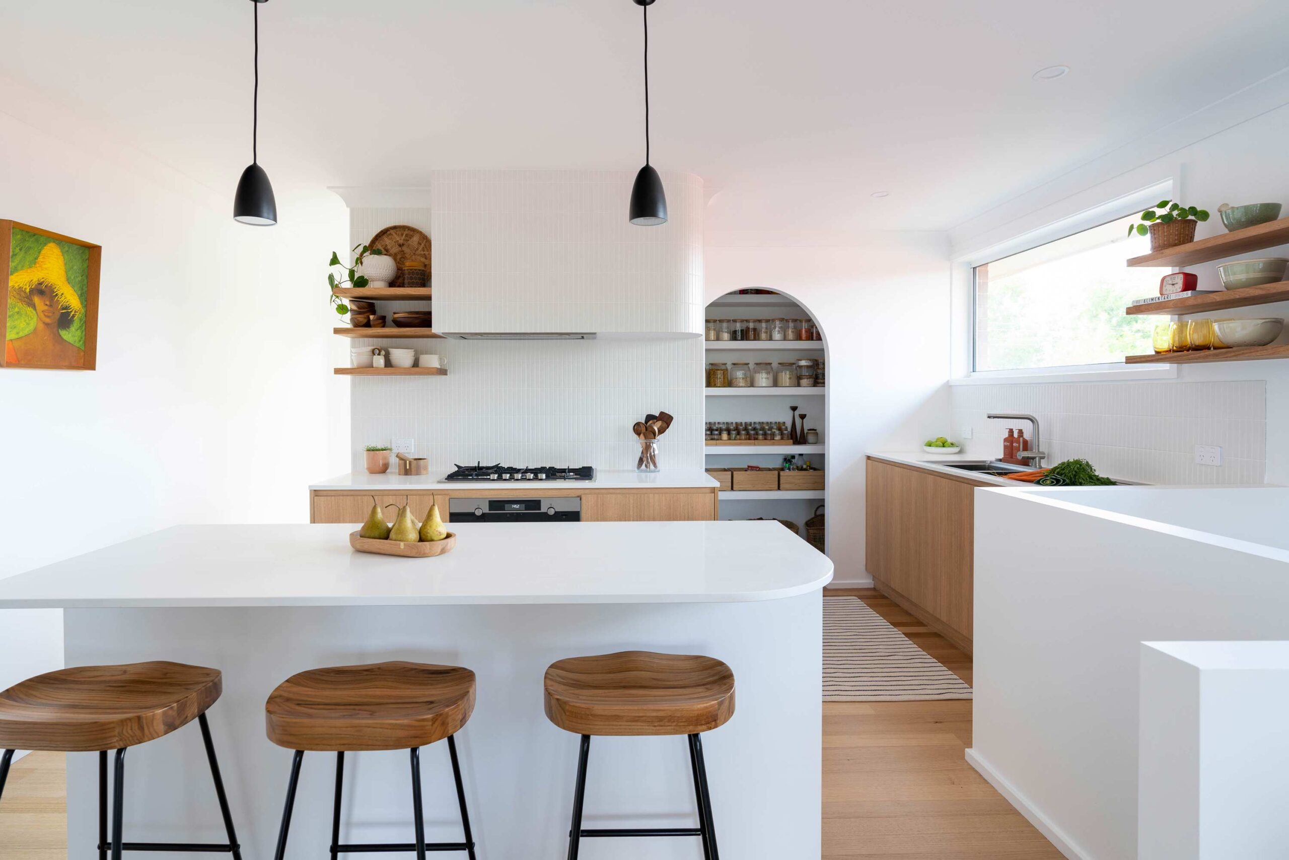
The goal for this renovation was to open up the kitchen layout and create a bright, functional space that felt welcoming and seamlessly connected to the rest of the home. The client wanted a crisp, clean design with plenty of natural light, which was achieved in part by relocating the laundry entrance to allow a passage of light from the back door. The overall vision was to transform the kitchen into a user-friendly space that felt open and inviting.

Before the renovation, the kitchen was a dark, enclosed space that reflected its late-1970s origins. The layout was impractical, and the materials felt worn and outdated. Now, the space has been completely transformed into a bright and spacious kitchen that embraces natural light and modern functionality.
With a more open layout, improved storage, and carefully curated finishes, the new kitchen seamlessly blends practicality with style.

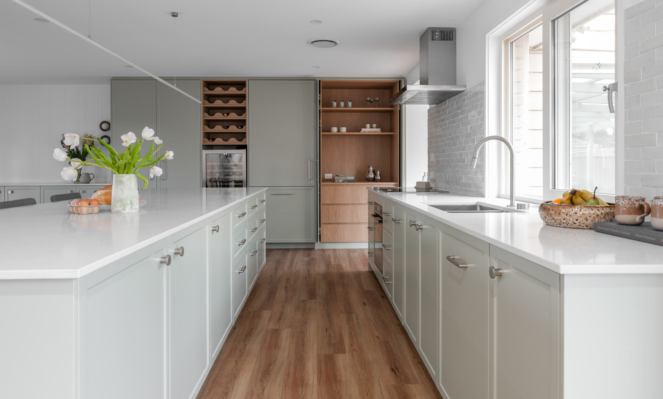
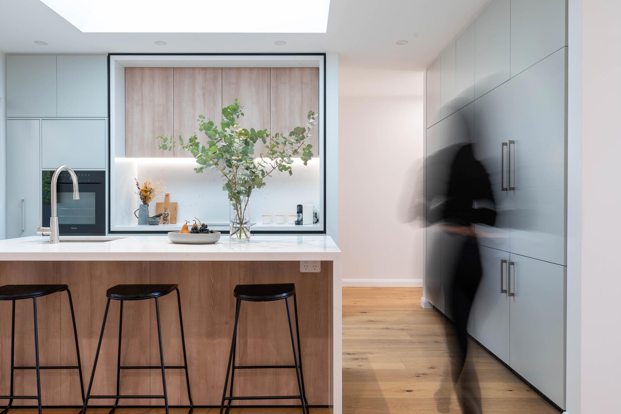
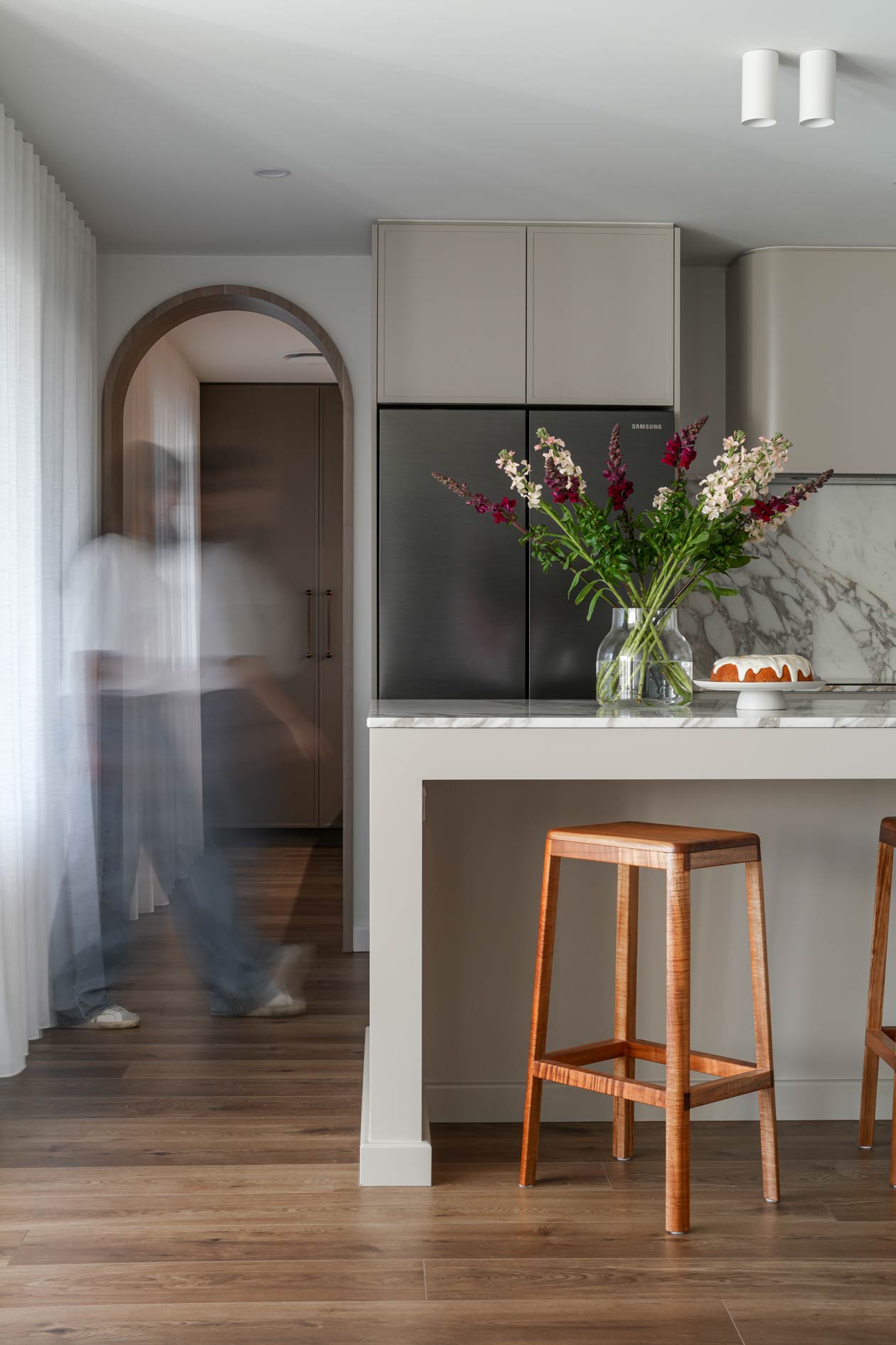
The intention was to create a fresh and airy kitchen that feels both modern and welcoming. A neutral white palette sets the foundation for a clean and crisp environment, while timber accents add warmth and depth.
The use of curved elements softens the space, preventing it from feeling too stark or harsh. Black accents provide just the right amount of contrast, enhancing the overall sense of balance.

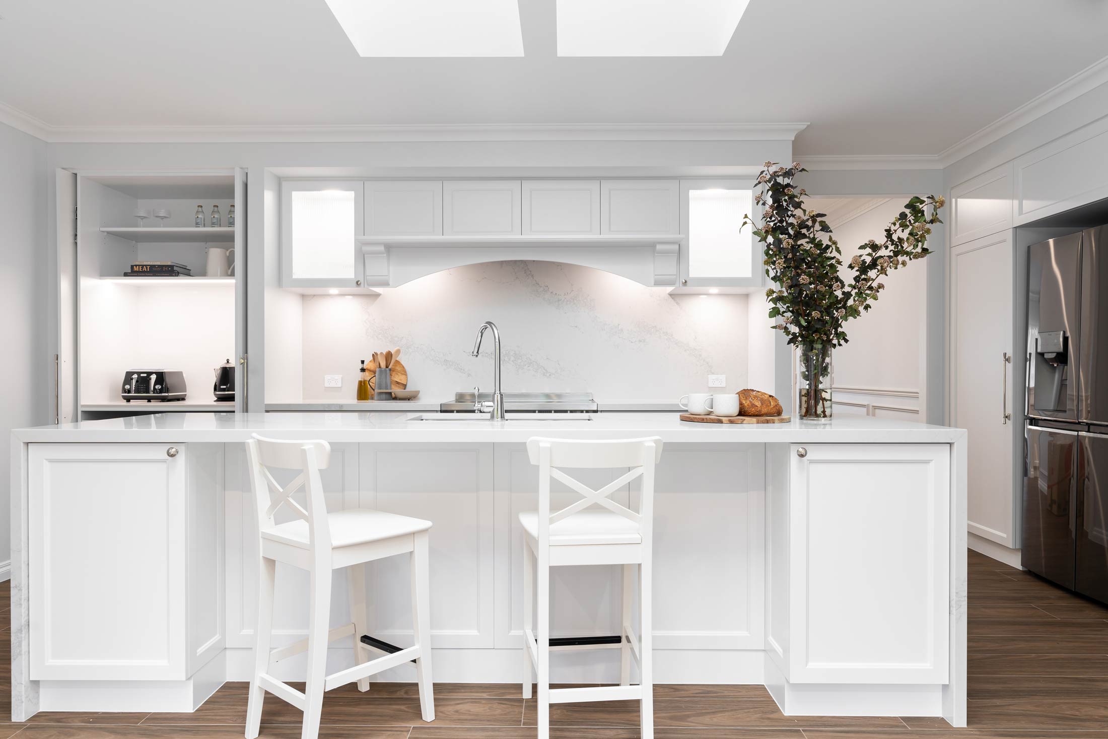
One of the most striking features of this kitchen is the use of soft curves, seen in the custom-built curved rangehood and the arched walk-in pantry doorway. These details tie into the home’s existing architectural elements and create a sense of flow throughout the space.
Timber shelving and restored solid timber flooring bring warmth and character to the space, ensuring that the kitchen feels homely despite its minimalist aesthetic.

The addition of white kit-kat tiles introduces a subtle texture that contrasts beautifully with the smooth stone benchtops.
Challenges & Solutions
One of the biggest challenges was maximising light and space within the constraints of the existing footprint. Adjusting the layout and relocating the laundry entrance allowed for better flow and significantly improved the amount of natural light entering the kitchen.
Another key consideration was maintaining cohesion with the home’s character. Instead of introducing sharp, modern lines that might feel out of place, the design incorporates curved elements that complement the home’s original arched openings in the dining and living areas. Functionality was also a priority, particularly in the butler’s pantry, where an open design was chosen to elongate the space and ensure ease of access.
More Projects